


If your website is slow, hard to use on mobile, confusing to navigate, or no longer reflects your brand, it’s probably costing you clients. This post walks through 10 specific warning signs, a self-audit checklist, and how to decide whether you need a quick refresh or a full rebuild.
For many small business owners, the website is something that got built a few years ago and then slowly moved to the back burner. You probably have been busy running your business, serving clients, and figuring out what growth actually looks like. Meanwhile, your website may have quietly fallen behind.
You might be dealing with a website that loads slowly. Or it feels clunky on your phone. Maybe the messaging no longer reflects who you serve or how much your business has evolved.
When people land on your website and leave confused or unconvinced, it does not just affect your online presence. It affects inquiries and revenue.
This guide walks through 10 signs your website may be due for more than a few small updates, plus how to tell whether you need a refresh or a more thoughtful rebuild.
Why Does Website Design Still Matter So Much?
Your website is one of the first impressions people have of your business, whether you realize it or not. Before someone ever gets on a call with you, sends an inquiry, or decides to trust you, they are quietly making decisions based on what they experience online.
And people make those decisions fast.
If your website feels outdated, confusing, hard to use, or inconsistent with the quality of your actual work, people notice. Fair or unfair, your website influences whether someone feels confident reaching out or moves on to someone else.
A strong website helps people trust you, understand what you do, and take the next step.

Sign 1: Your Website Isn’t Mobile-Friendly
More than 60% of web traffic now comes from mobile devices. If your site doesn’t adapt well to smaller screens, you’re losing a large portion of your potential audience before they ever see what you offer.
What to look for: Horizontal scrolling, text that requires zooming, buttons that are hard to tap, and images that don’t resize properly are all signs of a site that wasn’t built with mobile in mind.
This matters beyond user experience. Google uses mobile-first indexing, which means it evaluates the mobile version of your site when deciding where to rank you. A poor mobile experience can suppress your search rankings no matter how strong your desktop site looks.
You can test your site using Google’s Mobile-Friendly Test tool. If the results come back with a list of issues, minor tweaks won’t fix a site that wasn’t built on a responsive framework.
SELF-AUDIT PROMPT
Pull up your website on your phone right now. Can you read the text, tap the buttons, and navigate the menu without zooming or scrolling sideways? If not, your visitors are experiencing the same frustration.
Sign 2: Your Pages Load Too Slowly
People are impatient online, especially on mobile. If your website takes too long to load, many visitors will leave before they even see what you offer.
Slow websites create friction. They make businesses feel less trustworthy, less current, and harder to work with, even when the business itself is excellent.
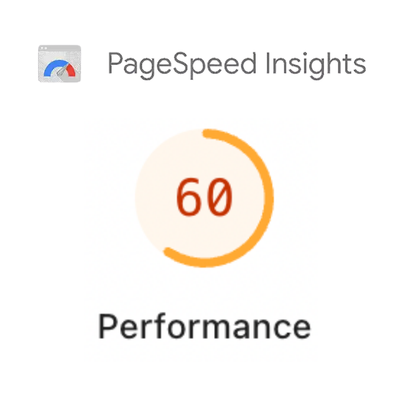
Common causes include oversized images, outdated code, too many plugins, and hosting that can’t keep up with demand. You can diagnose speed issues using tools like Google PageSpeed Insights or WP Rocket for WordPress sites.
Some speed problems can be resolved without a full redesign. But if your site consistently scores poorly and you’ve already addressed the obvious issues, the underlying architecture may be the problem.
Sign 3: Your Brand Has Grown But Your Website Hasn’t
Businesses evolve. You may have updated your logo, refined your niche, changed your pricing model, or shifted the type of client you want to serve. When your website still reflects who you were three or five years ago, it creates a disconnect.
Potential clients notice when your social media, email marketing, and printed materials look polished but your website looks like it belongs to a different company. Worse, they may wonder if your business is still active or operating at a professional level.
Your website should reflect your current values, your current clients, and the current quality of your work. If it doesn’t, it’s working against you.
Sign 4: Navigation Confuses Your Visitors
Good website navigation feels invisible. Visitors find what they need quickly, without having to think too hard about where to look.
Bad navigation is one of the most common reasons people leave a site. Overcrowded menus, vague labels, buried contact information, and a lack of logical flow all push visitors toward the back button.
What Good Navigation Looks Like
Most visitors should be able to find any page on your site within three clicks from your homepage. Your most important pages, including your services, about page, and contact information, should be accessible from every page on your site.
Common Mistakes to Avoid

- Too many top-level menu items (more than five or six creates decision overload)
- Vague menu labels that don’t tell visitors what they’ll find
- Contact information hidden in a footer or buried on a secondary page
- No clear path from a service page to a way to get in touch
Sign 5: Your Bounce Rate Is High
Bounce rate measures the percentage of visitors who land on a page and leave without viewing anything else on your site. A bounce rate between 40% and 60% is typical for most small business websites. Consistently above 70% is a signal that something on your site is driving people away.
Design plays a direct role here. Cluttered layouts, auto-playing videos, aggressive pop-ups, and a lack of clear messaging all contribute to high bounce rates. When visitors can’t quickly understand what you offer and how it helps them, they move on.
Tools like Google Analytics and Hotjar can show you where visitors drop off and how they interact with your pages. This data often reveals specific friction points that a thoughtful redesign can resolve.
Sign 6: Your Site Doesn’t Meet Accessibility Standards
Web accessibility means building your site so that people with disabilities can use it fully. This includes people who are blind or have low vision, people who are deaf or hard of hearing, and people with mobility impairments or cognitive disabilities.
Accessibility Matters for Three Reasons
It’s the right thing to do. About 26% of adults in the United States have some type of disability. Excluding them from your digital presence means excluding a significant portion of your potential customers.
It reduces legal risk. The Americans with Disabilities Act applies to websites, and small businesses have faced lawsuits over inaccessible sites.
It makes your site better for everyone. Clear headings, good color contrast, and descriptive link text improve the experience for all users, not just those using assistive technology.

The Web Content Accessibility Guidelines (WCAG) provide a clear standard to work toward. Level AA conformance is the widely accepted benchmark for most business websites.
If your site was built without accessibility in mind, a redesign is usually the most efficient path to getting it right. Our post Is Your Website Ethically Broken? goes deeper on what this looks like in practice. And if you want to understand the business case, Why Inclusive Web Design Drives Real Business Growth in 2026 is worth your time.
Sign 7: Your Website Isn’t Converting Visitors Into Clients
Traffic without conversions is just noise. If your analytics show people are visiting your site but not filling out contact forms, requesting consultations, or taking any meaningful action, your design is likely the problem.
Every element on your page either moves a visitor closer to saying yes or adds friction that slows them down. Unclear messaging, buried calls to action, forms that ask for too much information, and a lack of trust signals all contribute to low conversion rates.
Trust signals matter more than many business owners realize. Client testimonials, logos of organizations you’ve worked with, professional photography, and clearly displayed contact information all help visitors feel confident enough to take the next step.
Our guide to Unlocking the Potential of Your Website as a Sales Tool covers this in more depth, including specific tactics for turning browsers into buyers.
Sign 8: Your Content Management System Is Outdated or Hard to Use
Your content management system (CMS) is the platform you use to add and update content on your site. When it’s outdated or clunky, it creates a problem beyond aesthetics.
If updating a page or publishing a blog post feels like a major project, it won’t happen consistently. Fresh content is important for both search rankings and visitor trust. A site that looks like nothing has changed in two years sends a quiet message that the business may not be active or engaged.
Older CMS platforms also carry real security risks. Outdated software is a common target for hackers, and a compromised site can damage your reputation and get your domain blacklisted by search engines.
Modern platforms like WordPress, when properly set up and maintained, make it straightforward to update content without needing a developer. A redesign that includes migrating to a better CMS can change your entire relationship with your website.
Sign 9: Your Calls to Action Are Weak or Missing

A call to action (CTA) is the instruction that tells a visitor what to do next. Without clear, well-placed CTAs, people browse your site and then leave without engaging further because they weren’t sure what you wanted them to do.
What Makes a CTA Actually Work
Strong CTAs use specific, action-oriented language. “Get Your Free Consultation” works better than “Learn More.” “Start Your Project” is more compelling than “Click Here.” The phrasing should tell the visitor exactly what happens when they take that step.
Placement matters too. CTAs should appear at natural decision points throughout the page, not just at the very bottom. On a services page, the CTA should appear once the visitor has read enough to feel interested but before they lose momentum.
How Many CTAs Should Each Page Have?
Each page should have one primary CTA that aligns with the purpose of that page, plus one or two secondary options for visitors who aren’t ready to commit. Too few means missed opportunities. Too many creates confusion about what action is most important.
For more on how to structure pages that guide visitors toward action, see How to Optimize Your Homepage for Maximum Conversions.
Sign 10: Your Competitors’ Websites Are Noticeably Better
Your website doesn’t exist in isolation. When potential clients are evaluating their options, they’re visiting multiple sites, comparing how professional each business looks and how easy each one is to work with.
If a competitor’s site loads faster, looks more current, and makes it easier to get in touch, visitors may choose them by default, even if your actual services are superior.
QUICK COMPETITIVE AUDIT
Spend 20 minutes visiting three to five competitors’ websites. Ask yourself:
- Does their site load quickly?
- Is it easy to understand what they do and who they serve?
- Does it look professional and up to date?
- Is it easy to contact them or request a service?
- Does it work well on your phone?
If your honest answer is that their sites feel more trustworthy and easier to use, that gap is costing you business.
Is It Time for a Redesign or Just Some Updates?
Not every problem requires starting over. Here’s a quick way to think about it:
A targeted refresh may be enough if your site’s structure and functionality are solid, but it looks dated or some content needs updating.
A full redesign makes sense if you’re experiencing multiple issues at once, especially around mobile responsiveness, site speed, navigation, accessibility, and conversions. Patching one problem at a time on a weak foundation usually costs more in the long run than rebuilding properly.
✅ Website Health Checklist
Design and User Experience
Performance and Technical Health
Conversion and Business Alignment
Accessibility
What a Strategy-First Redesign Actually Looks Like

One of the most common mistakes small businesses make is jumping straight into design before getting clear on strategy. A new look won’t fix a site that doesn’t know what it’s supposed to accomplish.
At Bay Laurel Solutions, we start every project with an Online Success Session. A focused strategy conversation where we map your business goals to the specific functionality your website needs. Before any wireframes are drawn or colors are chosen, we align on what success looks like for you.
The session fee is credited toward your project when you move forward. It ensures that your redesign is built on a clear strategy, not guesswork.
From there, the process moves through site architecture, wireframes, design, development, and thorough testing before launch. You’ll always know what’s happening and what’s coming next.
What Should You Expect to Invest?
For small businesses, a professional website redesign typically ranges from $5,000 to $30,000 depending on the complexity of your site, the level of custom functionality needed, and the scope of the content work involved.
Most redesigns take between 4 and 8 weeks from kickoff to launch. Your new site is built in a staging environment so your current site stays live throughout the process.
The right question isn’t just “how much does this cost?” It’s “what is my current website costing me?” Lost leads, low conversion rates, and poor search visibility all have a dollar value. A well-built website is an investment that pays back.
Ready to Find Out What’s Holding Your Website Back?
If your website feels a little off, you are probably noticing something real.
Maybe it no longer reflects your business. Or it might feel harder or more complicated than it should. Maybe you’re getting traffic but not inquiries.
You do not need to jump straight into a redesign to figure that out.
A good place to start is understanding what is actually working, what is not, and what would make the biggest difference for your business moving forward.
Learn more about our Online Success Program to book an Online Success Session to get clear on what your website actually needs.