


Color is not decoration. It is positioning. In the snap of a finger, someone has already decided how they feel about your brand. Here is how to make that decision work in your favor.
One of the most common mistakes I see is founders choosing colors they personally love instead of colors their audience needs.
Deep burgundy. Rich gold. Dramatic contrast.
Beautiful, yes. Smart? Not always.
For example, imagine you serve overwhelmed nonprofits, first-time founders, or budget-conscious clients. Luxury-coded colors can unintentionally create distance instead of trust.
Color psychology goes deeper than trends. It is about emotional alignment. Most small businesses never evaluate their palette through that lens.
💡 The fast version: Studies show that up to 90% of snap judgments about products are based on color alone. Your brand color is doing a lot of heavy lifting before your headline even registers. This guide will help you make sure it’s working in your favor.
What Brand Color Psychology Actually Is (and Isn’t)
Color psychology is the study of how colors affect human behavior, mood, and decision-making. It is a real field backed by real research. It is also one of the most misapplied concepts in branding.
Here is what it is not. A magic formula where blue always means trust and red always means danger. Color associations are real, but they are also contextual, cultural, and personal. A color that builds confidence in one industry can signal alarm in another.
What color psychology is. A framework for making intentional decisions about the emotional experience you want your brand to create, and then testing whether it is working.
⚠️ The biggest mistake: Choosing brand colors based on personal preference rather than audience research. Your clients are not you. The colors that feel right to you may communicate something completely different to the people you’re trying to serve. (Sound familiar? We wrote about this in our piece on knowing your audience before you build anything.)
What Does Each Color Actually Communicate?
The Emotional Associations Most Colors Carry
Think of these more as tendencies, not rules. Use them as a starting point, not a conclusion. Your specific shade, saturation, and context will shift these associations significantly.
Red
Urgency, energy, passion. Strong for CTAs and sales. Use sparingly, because physiologically activating, and can create anxiety in high doses.
Orange
Warmth, friendliness, accessibility. Approachable without being aggressive. Popular with creative and community-focused brands.
Green
Growth, health, sustainability. Strong for wellness, finance, and environmental brands. Good for conversion moments. Also signals ‘go’.
Blue
Trust, calm, reliability. The most universally used color in professional services and tech. Can feel cold without warm accents.
Purple
Luxury, creativity, wisdom. Strong for premium offerings and spiritual or wellness services. Overused in AI branding right now.
Yellow
Optimism, attention, warmth. Excellent for grabbing focus but difficult to sustain. Yellow backgrounds are known to cause eye fatigue.
Two colors don’t fit neatly into emotional categories but deserve mention. Black communicates authority, sophistication, and luxury when used intentionally. White signals clarity, cleanliness, and space – but pure white backgrounds can actually increase reading fatigue compared to warm off-whites.
✅ Accessibility note: Color contrast isn’t just a design choice – it’s a legal and ethical requirement. WCAG accessibility standards require a minimum 4.5:1 contrast ratio for body text. Low contrast text excludes users with visual impairments and also tanks your SEO. Both things can be fixed at the same time. We cover this in depth in our guide to inclusive web design and share a free resource to download.
Why Your Audience’s Culture Changes Everything
This is the part most branding guides skip over entirely, and it matters enormously, especially if you serve diverse communities or operate across cultural contexts.
Color associations are not universal. They’re learned, cultural, and vary dramatically by region, religion, age, and context. Applying Western color associations to a global or multicultural audience without research is how you end up with a brand that accidentally communicates something you never intended.

90%
of snap judgments about products are made based on color alone
85%
of shoppers say color is the primary reason they buy a product
80%
increase in brand recognition from consistent color use across platforms
A Few Cultural Color Differences Worth Knowing
White in many Western contexts means purity, minimalism, and cleanliness. In several East Asian and South Asian cultures, white is associated with mourning. Red in China is a powerful symbol of luck and prosperity – the opposite of danger. Green carries religious significance in Islamic cultures. Yellow is sacred in several Buddhist traditions but signals caution in many Western markets.
This doesn’t mean you need a different brand for every market. It means you need to research your specific audience before you finalize your palette – the same way you’d research any other aspect of your customer insight strategy.
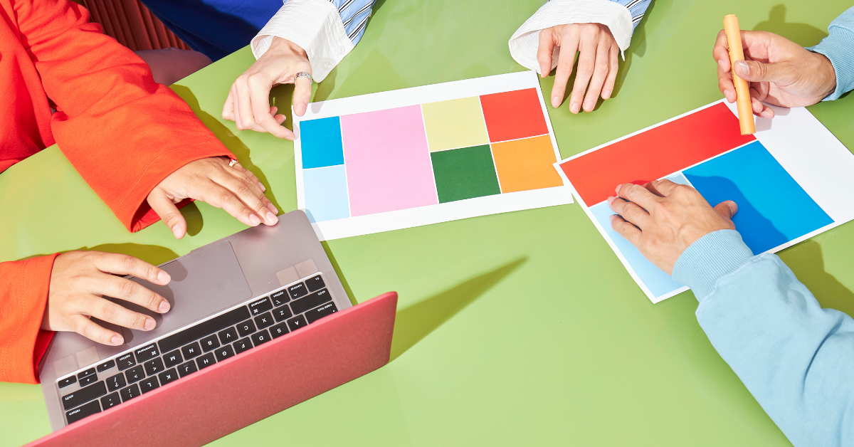
How to Build a Color Palette That Converts
Start With Strategy, Not Aesthetics
Before you open a color picker, answer these three questions. Who is my ideal client and what emotional state are they typically in when they find me? What do I want them to feel within the first five seconds of seeing my brand? Do I need to be differentiated from? What colors do my main competitors use?
The answers to those questions should drive your palette selection. A therapist serving anxious professionals needs different colors than a party planning business. A feminist web design agency (hi) has different color priorities than a corporate law firm.
“Your brand color is a first impression.
A positioning statement.
A conversion tool.
All at once.”
The Three Colors Every Brand Needs
Most effective brand palettes are built on three colors with clear roles. Your primary color carries 60% of your visual brand. That is your logo, your main headings, your dominant presence. Your secondary color takes 30%, those are supporting the primary without fighting it. Your action color gets 10%, you can keep it reserved specifically for buttons, links, and conversion moments. Its power comes entirely from restraint.
💡 Record your exact color codes. HEX for digital. RGB for screen. CMYK for print. Color inconsistency across platforms creates what researchers call “subconscious brand dissonance” – your clients can’t name it, but they feel it. It erodes trust quietly. Tools like Coolors and Adobe Color make palette building and documentation easy.
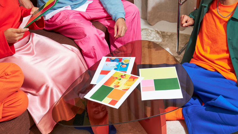
Which Colors Work Best for Your Industry?
Industry Norms Exist for a Reason, But They Are Not a Cage
Industry color norms exist because they’ve been tested by millions of buying decisions over decades. Deviating too far from them can undermine trust before you’ve earned it. But blending in completely means no differentiation – your brand disappears into the category.
The goal is to meet the category expectation in your primary color, then differentiate in your secondary and action colors. Here’s a starting framework:
| INDUSTRY | PRIMARY COLOR DIRECTION | DIFFERENTIATION OPPORTUNITY |
|---|---|---|
| Food & Hospitality | Red, orange, or warm yellow (stimulates appetite) | Cream and warm neutrals for a premium feel |
| Financial Services | Deep blue or navy (signals trust, stability) | Warm green accents to suggest growth without stuffiness |
| Healthcare & Wellness | Blue or green (signals calm, safety, healing) | Soft warm tones to reduce clinical coldness |
| Professional Services | Navy, charcoal, or deep green (signals authority) | Gold or terracotta accents for warmth and approachability |
| Nonprofits & Social Impact | Green or warm orange (signals community, care) | Bold accent colors that reflect the specific cause or community served |
| Creative Services | More flexibility here (personality is expected) | Avoid purple gradients on white (massively overdone in 2025) |
One note on testing competitors: look at the top 5 brands in your category and identify the dominant color. Then identify what’s missing. If everyone is using navy, there’s white space in warm sage green. That gap is yours to claim – if the research supports it for your audience.
The 60-30-10 Rule and Why Most Brands Break It
The 60-30-10 rule is one of the most practical frameworks in visual design. Most brands either do not know it or do not apply it consistently, which is why so many websites feel visually chaotic even when the individual colors are nice.

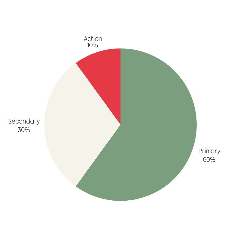
Your primary color is your foundation. It shows up in your logo, your main headlines, your hero section, your dominant visual elements. Your secondary color creates breathing room and visual interest – backgrounds, borders, supporting sections. Your action color – the 10% – is the most important color strategically. It tells people where to look and what to do. Its power comes from using it sparingly.
⚠️ The most common 60-30-10 mistake: Using your action color everywhere. When your CTA button color appears in your header, your body text links, your icons, your illustrations, and your footer, it stops being a signal and becomes noise. Your “buy now” button loses its power because nothing around it is creating contrast. Reserve it ruthlessly!
How Do You Know If Your Colors Are Actually Working?
Test Behavior, Not Opinions
Opinions about color are cheap and often wrong (including your own). The only reliable signal is behavior. Are people clicking? Staying? Are they converting?
The fastest way to test color effectiveness is A/B testing your CTA button. This is the highest-leverage single test available because it directly connects a color decision to a conversion outcome. Change only the button color between two versions, send equal traffic to each, and measure clicks over two to four weeks. Even a 10% lift compounds significantly over time.
Tools Worth Using
Hotjar gives you heatmaps showing where visitors actually look and click, which tells you if your visual hierarchy is doing what you think it is. Google Analytics tracks bounce rates and session duration by page, which reveals whether your color choices are creating an environment people want to stay in. VWO and Optimizely are purpose-built A/B testing platforms if you want more control.
Document everything. Record what you tested, what changed, and by how much. Build a data-driven picture of what your specific audience responds to, because that’s worth far more than any general color psychology guide, including this one.
Does Color Consistency Really Matter?
Yes, more than most people realize. Research shows consistent color use across platforms increases brand recognition by up to 80%. But consistency doesn’t just help with recognition. It builds the subconscious trust that makes people more likely to buy.
When your website uses one shade of green, your Instagram uses a slightly different one, your email templates use a third, and your printed materials use a fourth, your clients can’t articulate why your brand feels slightly unreliable. They just feel it. And that feeling affects conversion.
Where Color Inconsistency Hides
The most common culprit is social media. Templates get duplicated, filters get applied, screenshots get used instead of original files. Build a brand kit in Canva or Figma with your exact HEX codes locked in, and make sure everyone touching your brand has access to it. Set a quarterly reminder to audit your visual presence across every platform where you show up. This connects directly to homepage conversion optimization. Your homepage and your social presence should feel like they belong to the same brand.
So Where Do You Start?
If your current brand colors were chosen because you liked them personally, or because they were the defaults in whatever tool you used to build your logo, this is worth revisiting. Not because there’s anything wrong with them aesthetically, but because you don’t yet know if they’re working for your business.
🚀 Start here this week: Pull up your website and your most recent social post side by side. Do they look like they belong to the same brand? Do the colors create the emotional impression you want your clients to have? If the answer to either question is “not really,” that’s your starting point.
Color decisions made intentionally, grounded in audience research, tested against real behavior, and maintained consistently, compound over time into genuine brand equity. It is one of the quietest and most underestimated conversion levers available to small businesses.
If you want help building a brand presence that is visually cohesive, ethically designed, and conversion focused, that’s exactly what we do at Bay Laurel Solutions. We are a women-led, LGBTQ+ web design studio in San Francisco, and we would love to talk about your brand.