


What comes to mind when you hear the word feminist?
It’s printed on t-shirts, weaponized in headlines, and misunderstood by half the internet. The word gets tossed around, often misused or politicized, especially outside traditional activism. Like in design.
But what if I told you feminist web design could solve your biggest website problems?
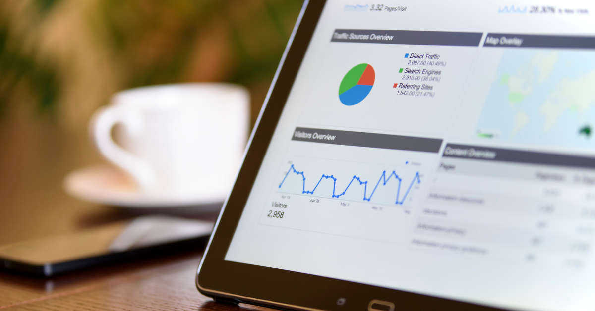
Imagine you’re trying to buy a gift online. The website loads slowly. Pop-ups block everything. The checkout won’t accept your apartment address. After 15 minutes of frustration, you give up.
Compare that to: Clean layout. Clear navigation. Three clicks to purchase. Done.
The difference? The second site was designed with real people in mind.
It’s not about slapping a bold font next to a stock photo of a diverse team. It’s not an aesthetic.
It’s about asking deeper questions:
- Who is this website really for?
- Who gets left out?
- How can we make this better for everyone?
When done right, it works. Higher engagement. More trust. Sites people actually want to use.
But first, let’s talk about how we got here.
How Tech Got So Exclusive (And What We’re Doing About It)
For decades, the tech and design industries have centered male perspectives, often unconsciously. Everything from default profile pictures to common design choices shows the tech world reflects the people who built it: mostly white, mostly male, mostly able-bodied.
The numbers tell the story across multiple dimensions. Women currently hold only 26.7% of tech-related jobs, and while women make up 47% of all employed adults in the US, they comprise only 35% of STEM workers. LGBTQ+ representation in tech remains low at just 2-3%. People with disabilities face unemployment rates 2.5 times higher than their abled peers, with only 22.7% employment rate among those with a disability overall. This lack of diversity isn’t just a hiring problem. It shapes every product decision, every default setting, every assumption about who will use the technology.
Think about the “defaults” we see everywhere. Generic male avatars, color schemes that prioritize bold over accessible, user personas that assume everyone has the same needs and abilities, forms that only recognize traditional family structures, and interfaces that assume everyone navigates the same way. These choices aren’t neutral. They reflect the perspectives of the people making them.
Feminist design starts by challenging all of those assumptions.
Designing for Access, Not Assumptions
Websites are not neutral. Every design choice either removes a barrier or reinforces one.
Feminist web design starts with the belief that access is a right. It challenges the idea of a “default” user and asks how we can create digital spaces that work for a wide range of people.
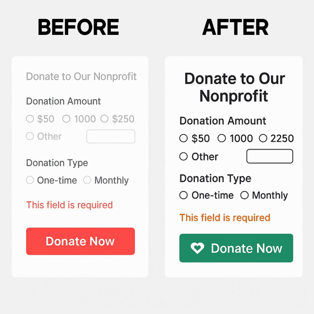
Before: A nonprofit’s donation form uses thin, light gray text on a white background. The “Donate Now” button is bright red. Users with visual impairments struggle to read the form details, while users with color blindness can’t distinguish the button from error messages that also appear in red.
After: The same form uses high-contrast text (dark gray on white), clear hierarchies with adequate spacing, and a donation button in accessible green with a descriptive icon. Error messages appear in a distinct orange with helpful text, not just color coding. The result: 40% more completed donations and positive feedback from users with visual impairments.
These standards are outlined by the Web Content Accessibility Guidelines (WCAG), which include three levels: A (basic), AA (standard), and AAA (advanced). Bay Laurel builds every site with WCAG AA compliance as the starting point. We also offer options for AAA-level compliance, accessibility widgets, multi-language functionality, and other inclusive features.
Unfortunately, most developers don’t build with accessibility in mind. In fact, over 94% of home pages had detected WCAG 2 failures according to WebAIM’s analysis of the top 1 million websites. As more people turn to DIY tools and freelance developers, these gaps are growing.
Why it matters: A website designed with access in mind builds trust, reaches more people, and reflects a real commitment to equity. That includes how your content is structured, how easy it is to navigate, and how well your site performs across devices and internet speeds.
Read more: WCAG Website Accessibility Is Non-Negotiable. Here’s How to Get It Right.
Creating Space for Everyone
Good design starts with listening. It values lived experience and centers the people your website is meant to support, not just stakeholders or internal goals.
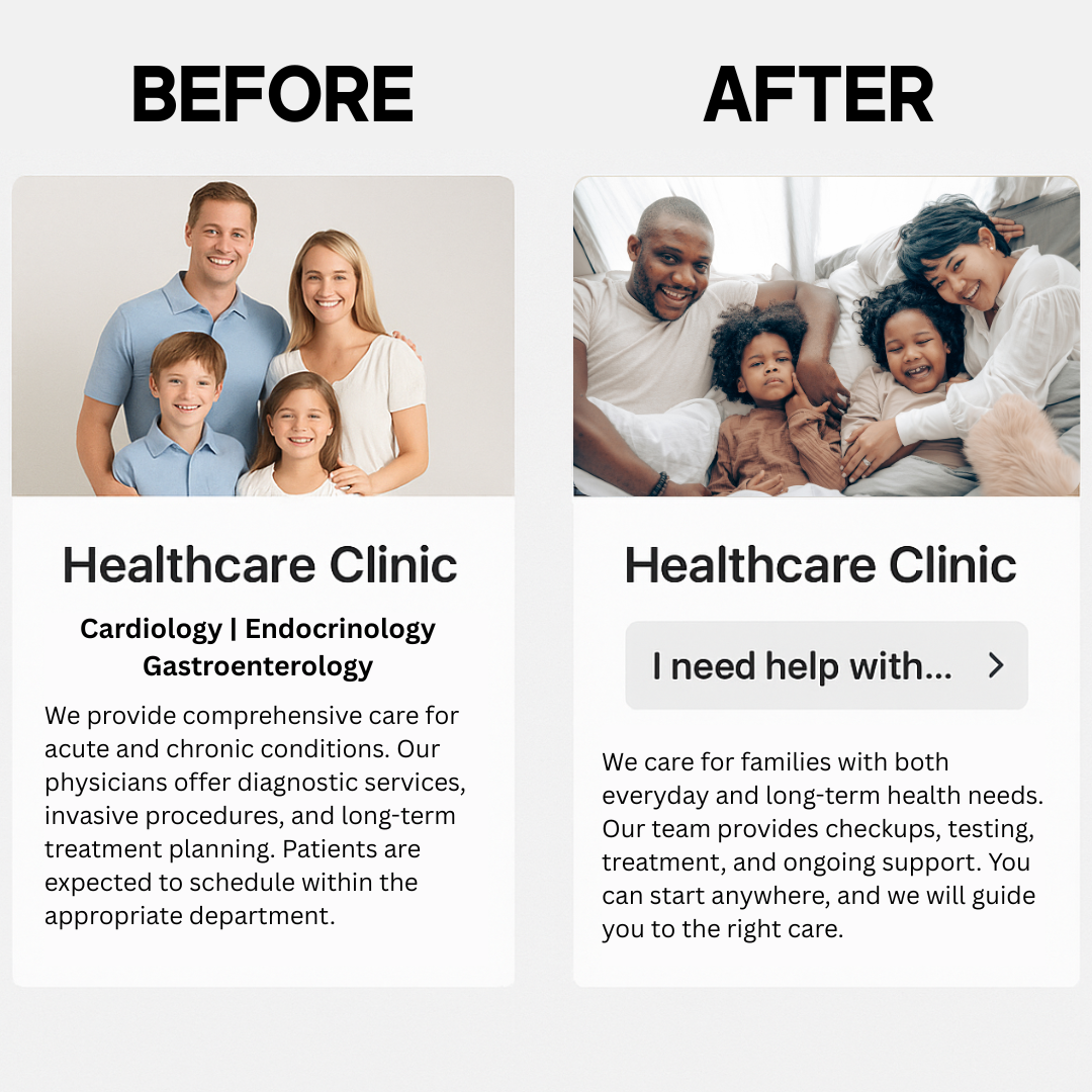
Before: A healthcare clinic’s website features stock photos of smiling white families and uses medical jargon throughout. The navigation assumes patients know exactly which department they need. LGBTQ+ patients, people of color, and those with limited health literacy feel unwelcome and confused.
After: The same clinic conducts interviews with actual patients from their community. The new site features authentic photos of diverse patients (with permission), explains services in plain language, and includes a simple “I need help with…” navigation that guides users based on symptoms or concerns rather than medical departments. New patient intake increases, particularly among previously underserved communities.
Feminist web design invites you to move beyond one-size-fits-all templates. It asks you to consider who is using your site, what they need, and how your content, structure, and visual language can reflect their reality.
This approach focuses on designing with empathy. It looks at tone, accessibility, cultural relevance, and how users move through your site. It challenges assumptions that are often baked into default systems or mainstream strategies.
It also extends to the client experience. If you’re working with a designer or team, communication should feel clear and grounded. You should not need to decode complex tech jargon to feel empowered in the process.
Why it matters: When people feel seen and considered, they are more likely to trust and connect with your work. A site shaped by real voices creates stronger relationships and reflects the communities you care about.
Breaking Up With Manipulative UX
Traditional web practices often prioritize conversion above all else. This leads to manipulative patterns, overwhelming popups, and a lack of transparency that erodes trust.
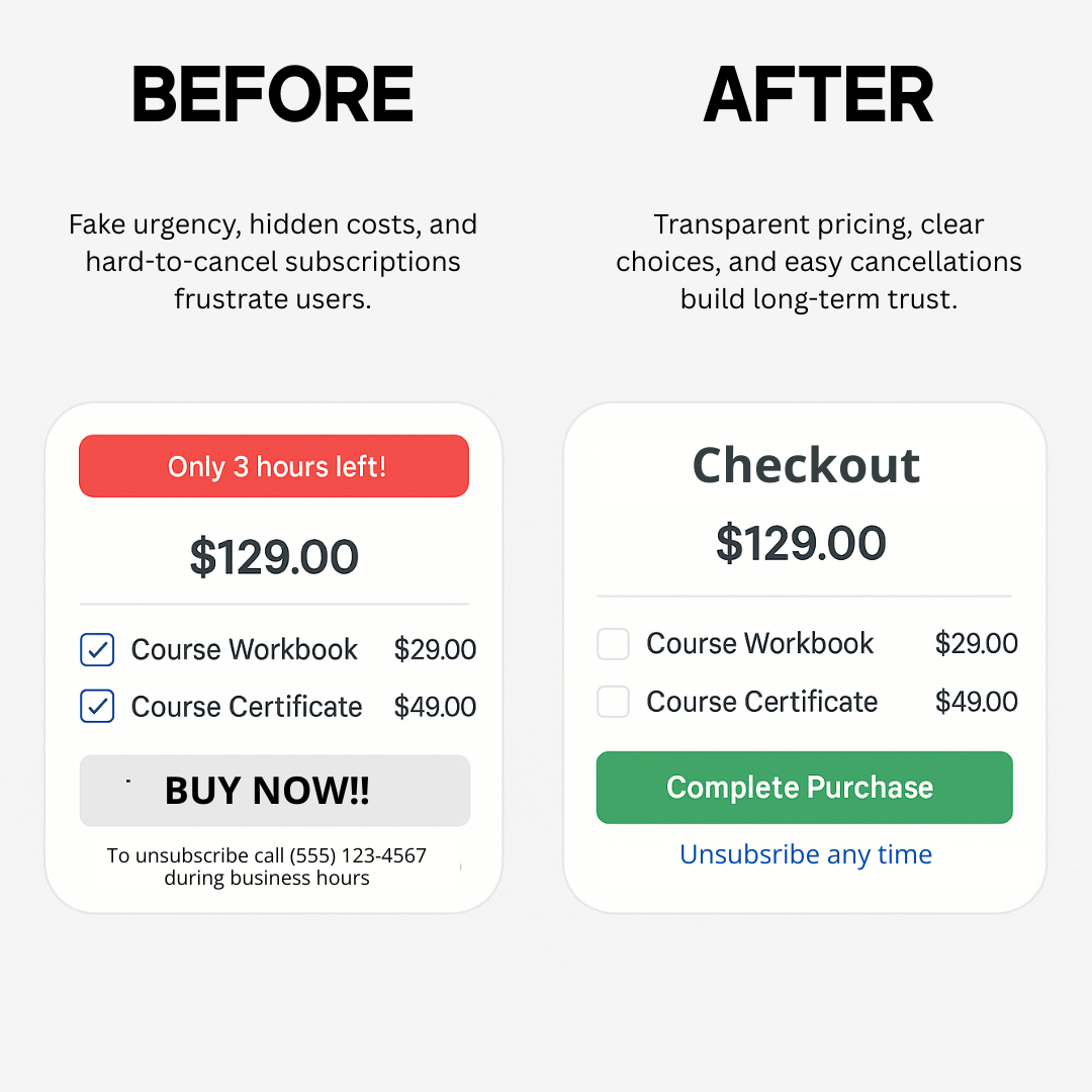
Before: An online course platform uses multiple dark patterns: a fake countdown timer claiming “only 3 hours left” (which resets daily), pre-checked boxes for expensive add-ons, and an unsubscribe process that requires calling during business hours. Users feel tricked and frequently request chargebacks.
After: The same platform removes fake urgency tactics, makes pricing transparent upfront, uses clear opt-in checkboxes, and provides a simple one-click unsubscribe link in every email. While immediate conversions drop slightly, customer lifetime value increases dramatically as trust builds.
Many modern websites are built to squeeze clicks, force subscriptions, and obscure choices. These tactics take control away from users and often leave them feeling misled or pressured.
Regulatory agencies like the FTC have taken aim at what are called “dark patterns“. These are deceptive design practices that steer people into actions they didn’t intend, often for the benefit of the business rather than the user. Common examples include confusing unsubscribe flows, hidden opt-out options, and misleading button designs.
These patterns are not just annoying. They often exist to power large-scale data harvesting. In 2024, surveys showed that 9 out of 10 internet users consider online privacy a serious concern. Many feel unable to protect their data or even understand what is being collected.
Feminist web design takes a different approach. It values clarity over coercion and supports decision-making that is honest, informed, and user-led. Instead of collecting every possible data point, what if a website tracked only the basics, like clicks or form submissions, and made that data collection clear in the privacy policy?
It is entirely possible to build a high-performing website without exploiting your audience. Ethical design still converts, and it builds the kind of trust that lasts.
Why it matters: When people feel respected and in control, they are more likely to stay, return, and become advocates for your work.
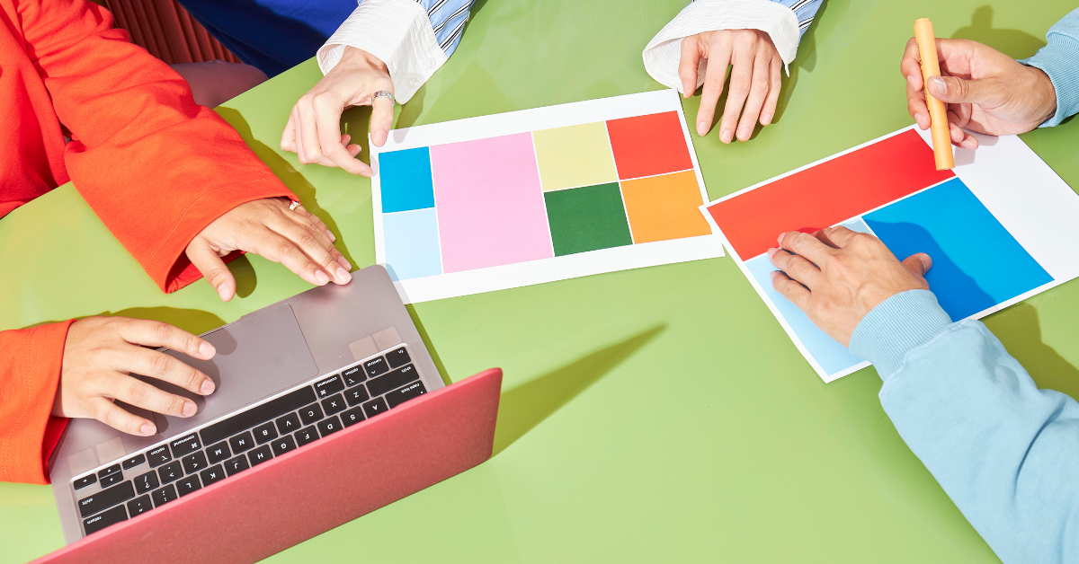
Building With You, Not Just For You
Most mainstream web design follows a top-down model. A designer takes the lead, makes the decisions, and hands off a finished product with little input from the client or community it’s meant to serve.
Feminist web design challenges that model. It sees the client as an expert in their own experience. It invites collaboration, active listening, and shared decision-making at every stage of the process.
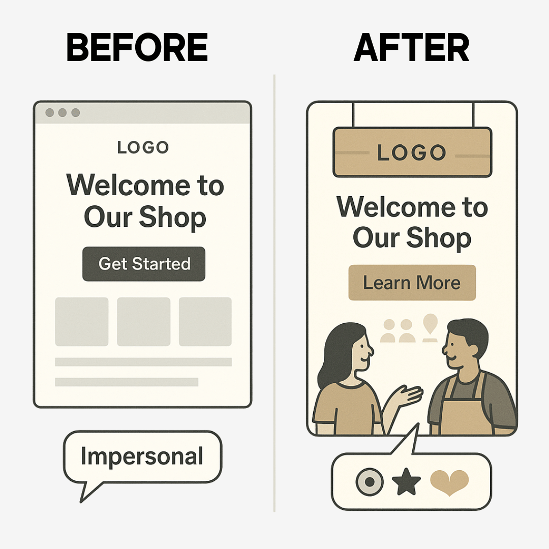
Before: A small business owner hires a designer who creates a sleek, minimalist site based on current trends. The designer chooses colors, fonts, and layouts without consulting the business owner’s vision or understanding their customers. The final site looks professional but doesn’t reflect the warmth and community focus that makes the business special. Customers comment that the website feels impersonal.
After: The same designer starts with discovery sessions, asking about the business owner’s values, their customers’ needs, and their vision for the brand. Together, they create a site that balances professional design with authentic personality. The business owner understands every choice and feels confident explaining their website to customers. The result: increased engagement and customers who say the website “feels just like being in the store.”
This approach asks questions rather than assumes answers. It makes space for client feedback, lived experience, and evolving needs. The goal is not just to build a functional site, but to create one that feels aligned, intentional, and rooted in the values of the people behind it.
Co-creation also reduces power imbalances. Instead of overwhelming clients with jargon or rigid systems, it offers clarity, flexibility, and transparency throughout the design process.
Why it matters: A website should feel like an extension of who you are and what you stand for. When you are part of the process, that alignment becomes possible. Co-creation makes that possible.
Feminist Design = Better Results
This isn’t just about doing the right thing, though that matters. Feminist web design delivers measurably better outcomes: higher engagement, lower bounce rates, and deeper trust with your audience.
The numbers back this up. Companies in the top quartile for gender diversity on boards are 27% more likely to financially outperform peers. Leadership gender diversity across executive teams shows increasingly stronger performance effect. When you design with real people in mind, they respond.
Ethical doesn’t mean less effective. It means more effective. When users feel respected, understood, and empowered, they become genuine advocates for your work. They stay longer, engage more deeply, and trust you with their most important decisions.
That’s the power of designing with intention, inclusion, and integrity at the center.
Interested in building a website that works for everyone? Our Online Success Program can help your website generate better leads and increase revenue utilizing inclusive and custom design. Get in touch to learn how feminist web design can transform your digital presence.
At Bay Laurel, we believe great design starts with great values.